Whatever you need, Octave has an arm for it.
Octave is an independent studio that plans, designs, builds and looks after digital products. One studio, from the first sketch to lifetime support.









The showreel didn’t load.

Eight services, one studio
-
Brand identity
Logos, type and color that hold up everywhere your brand appears.
Logo, identity system, guidelines
-
Web design
Marketing sites and landing pages that explain what you do and make the next step obvious.
Sitemap, wireframes, responsive design
-
Mobile app design
iOS and Android apps built around real habits and everyday workflows.
Flows, interface design, prototypes
-
Product design
UX and UI from the first flow to a design system your team can grow.
Research, flows, design system
-
Dashboards & data
Complex data turned into screens people can read at a glance and act on.
Data visualization, admin tools, analytics
-
Motion
Interface motion, product demos and launch films with a purpose.
UI motion, demos, launch films
-
Development
Fast, accessible, maintainable builds of the approved design.
Front-end, CMS, launch
-
Lifetime support
Fixes, updates and improvements for as long as your product is live.
Bug fixes, updates, ongoing care
Selected work
See all work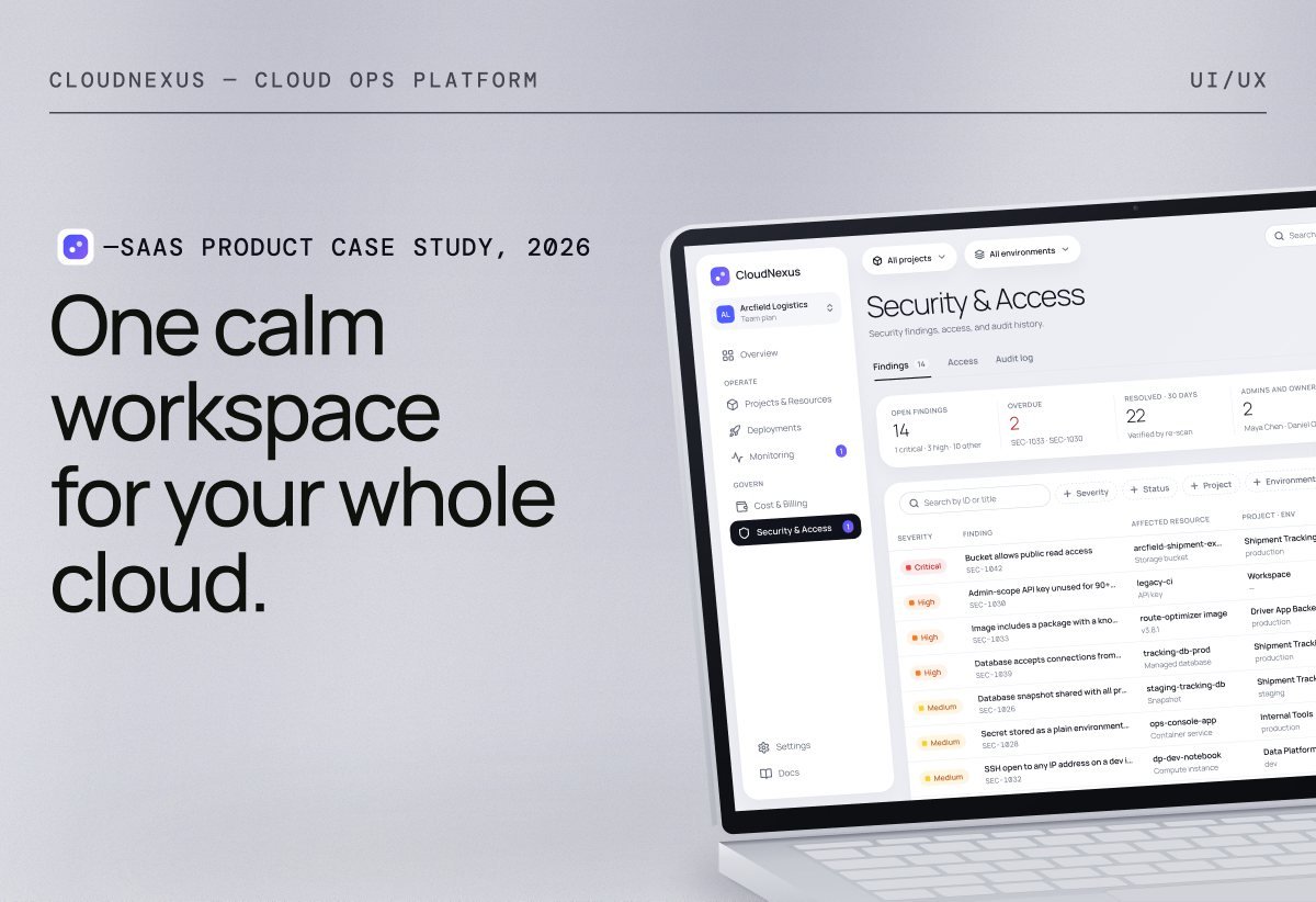

What clients say

“I highly recommend working with Ibrahim. He is very talented and delivers above and beyond, highly engaging product videos. Ibrahim designed and developed the onboarding video for my social app, Saturday, as well as several other videos we use in our marketing materials.”
 United States

Joshua MillerCo-Founder of RIZZ® and AffiliateNetwork.com Ibrahim is a highly talented and hardworking designer. It was delightful hiring him to craft a killer video as well as brainstorm product ideas.
United StatesKennethFounder Excellent work, great communication and Very easy to work with, listened to my ideas and made me an app design. I am very satisfied with. Highly recommended
 Puerto Rico

Yosef Chaim KahnFounder Excellent work I am very satisfied with this delivery. looking forward to continue working with you. thank you very much.
United StatesJaminshinCo-Founder He is talented. He made me what I wanted. I'd like to join him again next time.
 South Korea
ProducerFounder Ibrahim was amazing to work with!! Really cared about every little detail and really tried his best to make the greatest design he could. Highly recommend!
United States
Yosef Chaim KahnFounder Very good job I am a returning customer, and I'm not regretting it.
United StatesPrerakCo-Founder It was a great experience and he was very professional.
 Australia

Mayo AlexanderFounder Great design. great communication, looking forward to the next project ASAP
United StatesJohn MahonFounder Clear communication, and we worked best collaborating in real-time together via figma.
 Ireland

JorgeplCo-Founder I recommend Octave and I’ll write him for future project.
 Poland
How a project runs
-
01
Discover
We start with a conversation about your business, your users and what success looks like. We review what already exists, from your current product to competitors and analytics, and agree on goals, constraints and priorities.
You get: a clear brief
-
02
Define
Scope, structure and direction are agreed before any design starts. You get a clear plan covering user flows or sitemap, deliverables, timeline and budget, written down so everyone knows exactly what is being built.
You get: a written proposal
-
03
Design & build
Screens, brand and code are made side by side in short rounds you can click through and comment on. Each decision is reviewed with you along the way, so nothing arrives as a surprise at launch.
You get: work you can click through
-
04
Launch & support
We test across devices, prepare the release and hand over files and documentation. After launch, Octave stays on for fixes, updates and improvements for as long as the product is live.
You get: lifetime support
What changes with one studio?
Hiring separately means briefing a designer, a developer, a brand studio and someone for support, with the context split across hand-offs, files and tools, and the work translated from one team to the next. Once it launches, you still need to find someone new to look after it. With Octave, one studio takes you from start to finish: the context stays with the person doing the work, design and build are planned together from day one, and you get lifetime support from the people who built it.

Questions people ask first
Straight answers to what people ask before a project. Anything else is one email away.
We design and build websites, mobile apps, dashboards, digital products and brand identities. Projects range from first versions for new companies to redesigns of products that are already live, and many combine several of these, such as a brand identity and the website that launches it.
Yes. Each service can be commissioned on its own for a focused project, such as a brand identity or a single dashboard. You can also combine several, in which case they are planned as one project, with a single brief and one timeline.
Yes. Design and development are planned together from the start, so what is designed can be built as intended and nothing is lost at handover. If you already have developers, you can hire us for design only, and we deliver organised design files and specifications ready for your team.
Fixes and updates after launch for as long as your product is live, handled by the people who designed and built it. Your written proposal sets out exactly what is covered and how requests are handled. Anything beyond that, such as new features, is scoped and agreed with you before work begins.
Every project is quoted individually, based on its scope. After an initial conversation about your goals, you receive a written proposal setting out the deliverables, timeline and cost. No work starts until you have reviewed and approved it.
It depends on the scope and how many services are involved: a focused brand identity takes less time than a product designed and built from the ground up. Your proposal sets out a timeline in clear stages, and you review the work at each one, so you always know where the project stands.

Selected work
Selected projects across product, brand and web. Each case shows the problem, the thinking behind it and what changed.
Case Studies



Shots
Animations
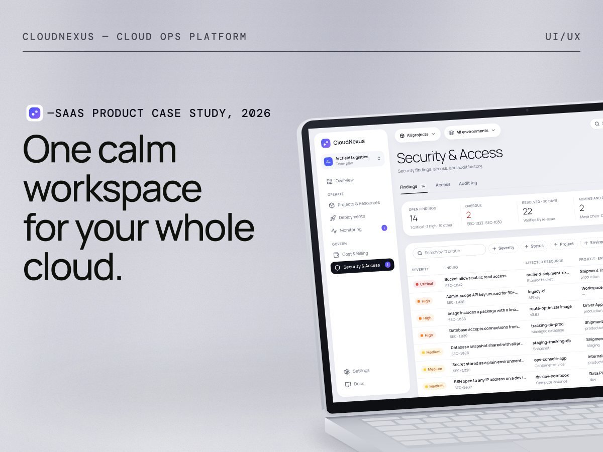
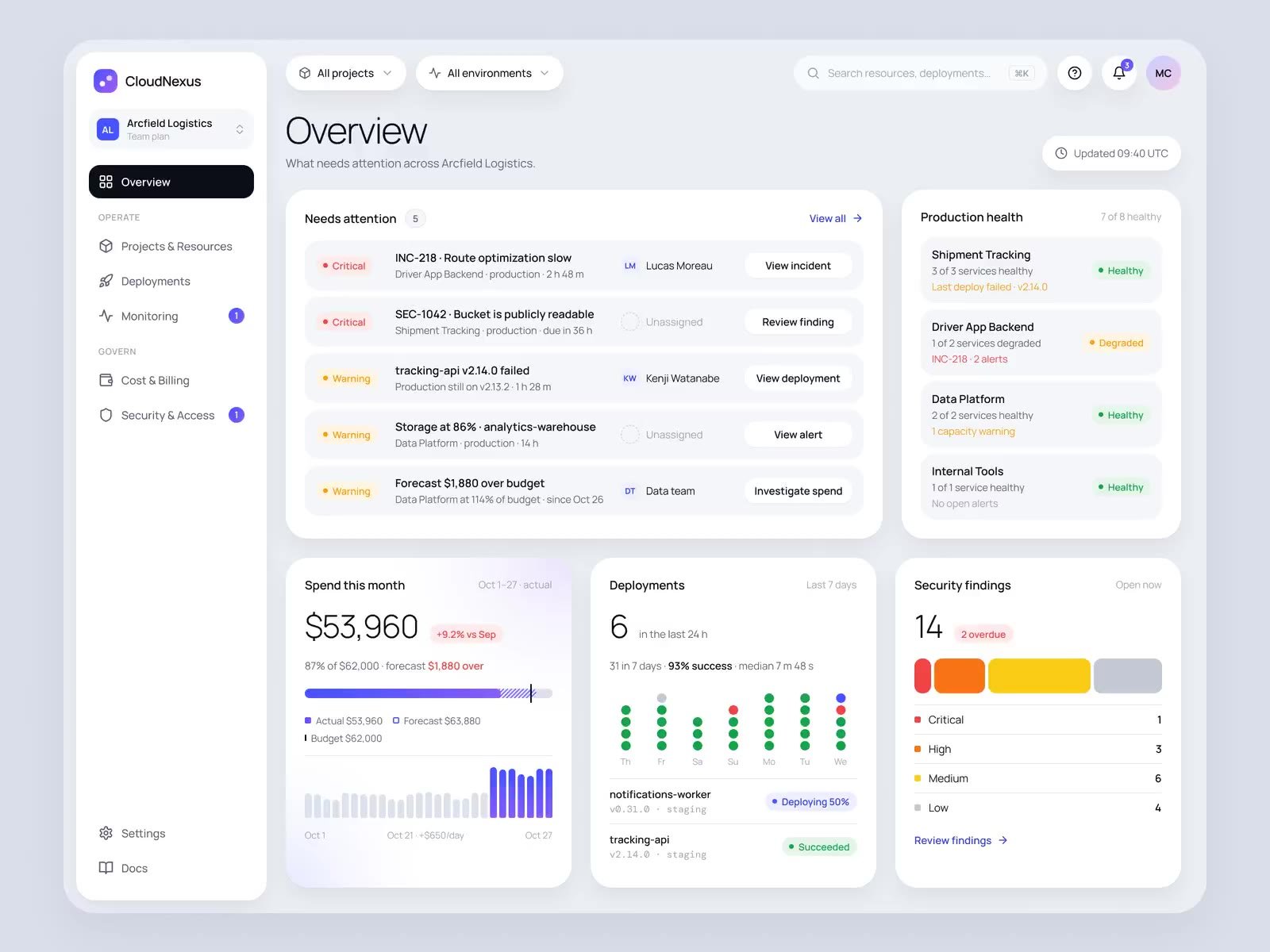
Case study: How CloudNexus brings deploys, health, cost and access into one calm workspace
Landing page, dashboard pages and the Luminous design system for CloudNexus, a platform where every deployment, alert, cost and permission traces back to a project and an owner.
- Role
- Product design, UX, UI, motion
- Scope
- Landing page, app pages and a design system
- Tools
- Figma
- Type
- Concept project, 2026
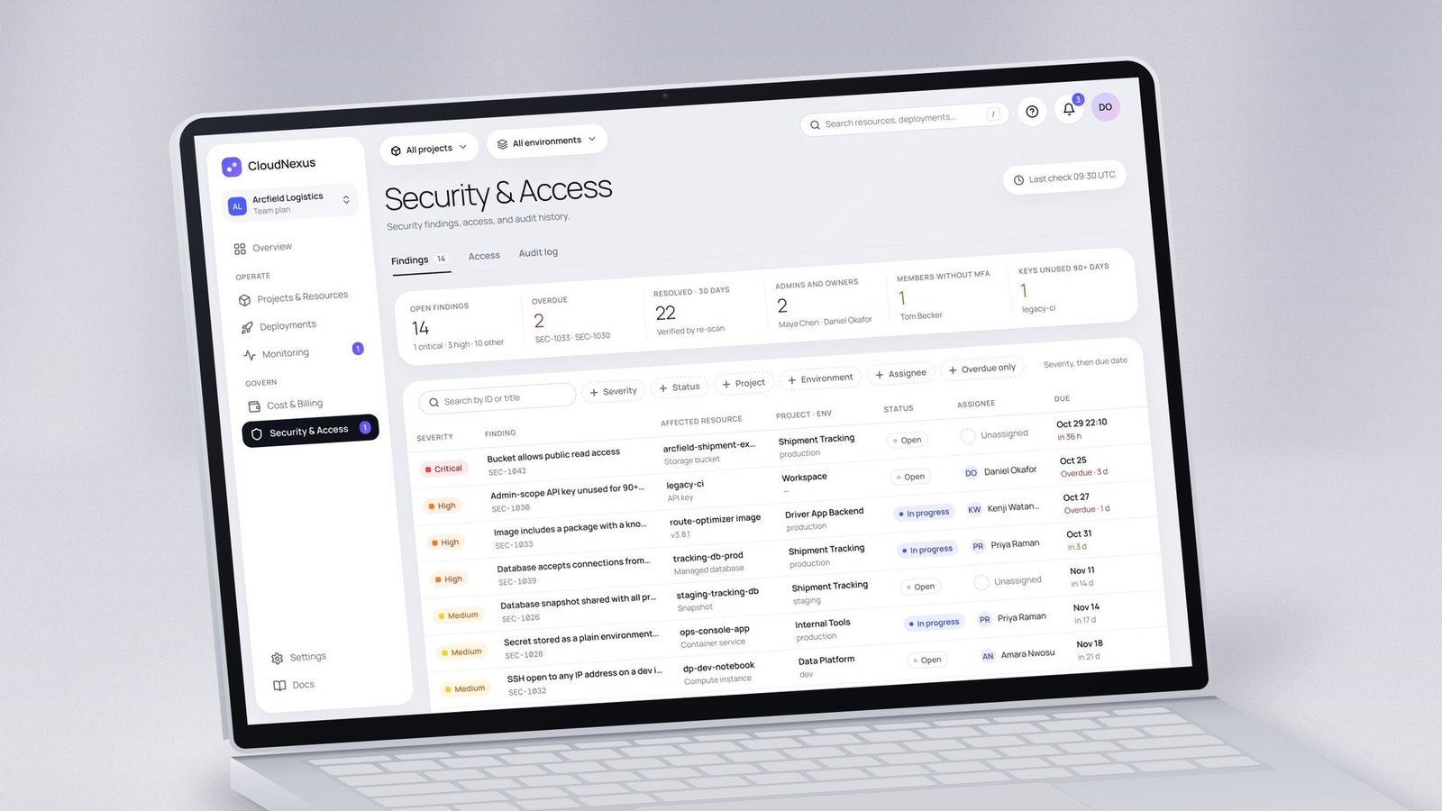
Overview
Ship, run, pay for and secure your cloud from one workspace.
CloudNexus is a fictional managed cloud platform for software companies with 30 to 300 engineers.
One model ties everything together
- Workspace
- Project
- Environment
- Service
- Resource
The problem
Deploys, health, cost and access live in four tools that name things differently. Everyday questions take hours, and finance learns about overspend only when the invoice arrives.
The goal
Make the answers obvious: what broke, what changed, why the bill moved and who has access, each traced to a project and an owner, with safe next actions.
My role
End-to-end product design: framing, personas, information architecture, flows, visual direction, design system, every screen, motion and launch visuals.
The challenge
Four tools, four names for the same thing.
A platform team of 2 to 10 people supports dozens of engineers, a finance owner and a security lead. Every simple question means cross-referencing four tools.
Everyday questions
- What broke?
- What changed?
- Why did the bill jump?
- Who has production access?
Where it breaks down
- Alerts arrive without the service, environment or owner attached.
- Deploy history lives apart from the metrics it affects.
- Costs are labelled with resource IDs, not teams, and the invoice comes too late.
- Access is granted ad hoc and rarely removed, with no audit trail.
“Everyday questions take hours of cross-referencing, and nobody can say who owns half the resources.”
Goals and principles
Success means a working team in its first week.
A team should deploy, investigate, allocate spend and control access within its first week on CloudNexus.
Product goals
Five goals, each with a signal to measure: a first successful deploy within 7 days of a trial, one session from alert to logs and metrics (time to acknowledge), monthly budgets allocated to owners (allocation coverage), critical findings resolved before their due date (median time to resolve), and teammates invited with the right access (invites accepted per workspace). The 7-day target is a hypothesis to test, not a reported result.
Design principles
Four principles shaped every screen. One ownership model: every resource has a project, environment and owning team, and unowned spend is never hidden. Change correlation: deploy markers sit on health and cost charts, and every alert lists recent changes. Daily cost attribution: spend is split by team every day, with a forecast before the invoice. Guardrailed actions: rollback, retry and access changes say exactly what they will change, or why they can’t run.
Persona
Four people, one workspace, different jobs.
Priya fixes, Maya oversees, Sofia forecasts and Daniel controls access. All four work at the same fictional company, Arcfield Logistics, so the data stays consistent on every screen.

Priya Raman
DevOps engineer, Developer role
“When a release fails or a service slows down, find the cause and the safest fix before customers notice.”
Priya wants production to stay reliable while she ships several times a day and keeps clear ownership of her team’s infrastructure. Today logs and deploys live in separate places, alerts arrive without context, and she’s never sure a rollback is safe. She spends most of her time in Deployments, Monitoring, and Projects & Resources.

Maya Chen
Engineering manager, Owner role
“Each morning, see whether my teams are healthy, shipping and on budget, and where I need to step in.”
Maya wants steady delivery, few customer-facing incidents and predictable spend for each team. Today she has to ask engineers for status, reports are stale or built by hand, and she can’t tell a mistake from growth. She mostly uses Overview and Cost & Billing.

Sofia Alvarez
FinOps manager, Billing role
“Each week and before month-end, know whether spend will land within budget and explain any variance.”
Sofia needs an accurate month-end forecast, an owner for every dollar and early warning of overruns. Today the invoice arrives too late, costs are labelled with resource IDs, and actual and forecast spend get mixed up. She works mostly in Cost & Billing.

Daniel Okafor
IT admin and security lead, Admin role
“Make sure no one has more access than needed and no exposed resource stays open, and prove it when asked.”
Daniel wants critical findings closed fast, least-privilege access and a complete audit trail. Today findings have no owners, everything is marked critical, and access is rarely removed when it should be. He works mostly in Security & Access and Team Settings.
The approach
From a product model to a living system.
Framing first, then a reusable system, then every screen and state, and finally motion and launch visuals.
Process
The work moved through six stages. Frame set up the product brief, four personas and one fictional workspace with real-feeling data. Structure mapped the sitemap, navigation groups, core user flows and a spec for every page. Explore tried three visual directions on the same Overview screen, Precision, Editorial and Luminous, and Luminous was chosen. System built tokens for colour, type, spacing and radius, then 77 icons and 49 components on top of them. Design covered the landing page, the app pages, and the drawers, dialogs and states between them. Bring to life added motion videos and prepared the work for development.
Information architecture
Landing page, app pages, everything else in context.
Details open as drawers, dialogs or scoped views, so people never lose their place.
Home
- Overview
Operate
- Projects & Resources
- Deployments
- Monitoring
Govern
- Cost & Billing
- Security & Access
Workspace
- Team & Settings
In context: resource, deployment, incident, cost line and finding drawers; invites, access reviews, budgets, alert rules, rollback and retry. The landing page is public; sign-up and sign-in were out of scope.
Core flows
Priya investigates a failed deployment
It starts with a notification that dep-4821 failed on production. Priya opens the failed deploy from the alert, reads the logs and what changed, and compares it with the last healthy version. Before rolling back she sees what the rollback won’t revert, then confirms and watches the rollout until the service is healthy again, with an audit event recorded.
Daniel fixes a critical finding
It starts with an alert for a new critical finding: a public bucket. Daniel scans findings sorted by severity and due date, opens SEC-1042 to see why it matters and reads the recommended fix. He assigns it to Kenji and sets it to In progress. Once public access is blocked, a re-scan verifies the fix and the finding is resolved.
Daniel invites a teammate
It starts in Settings, under Members & roles. Daniel chooses Invite members, enters an email and picks the Developer role, then limits access to 2 projects with production off. He reads the plain-language summary, sends the invitation, and a pending row appears with an expiry date.
Visual direction
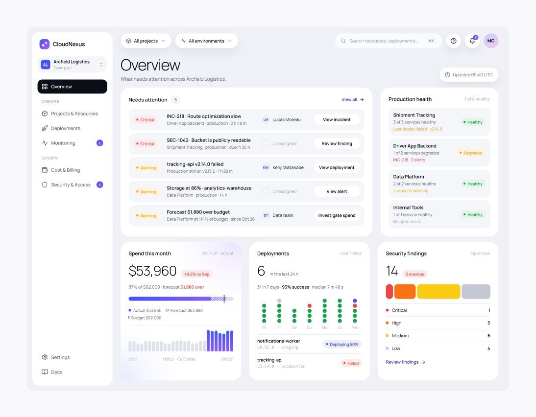
Three directions on one screen. Luminous won.
Each direction redrew the same Overview screen with its own type, colour and depth, so the comparison was about feel, not content.
Three directions
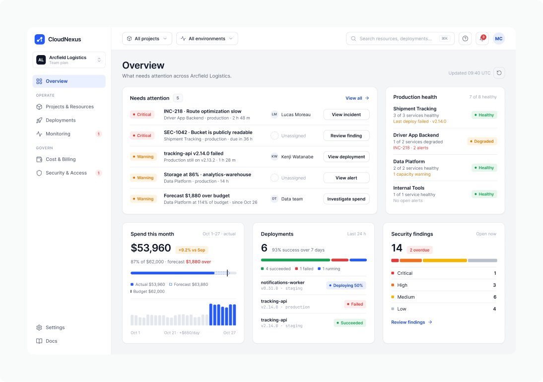
Precision
Crisp, high-density UI. Hairline borders and a single cobalt accent.
Calm, exact, trustworthy
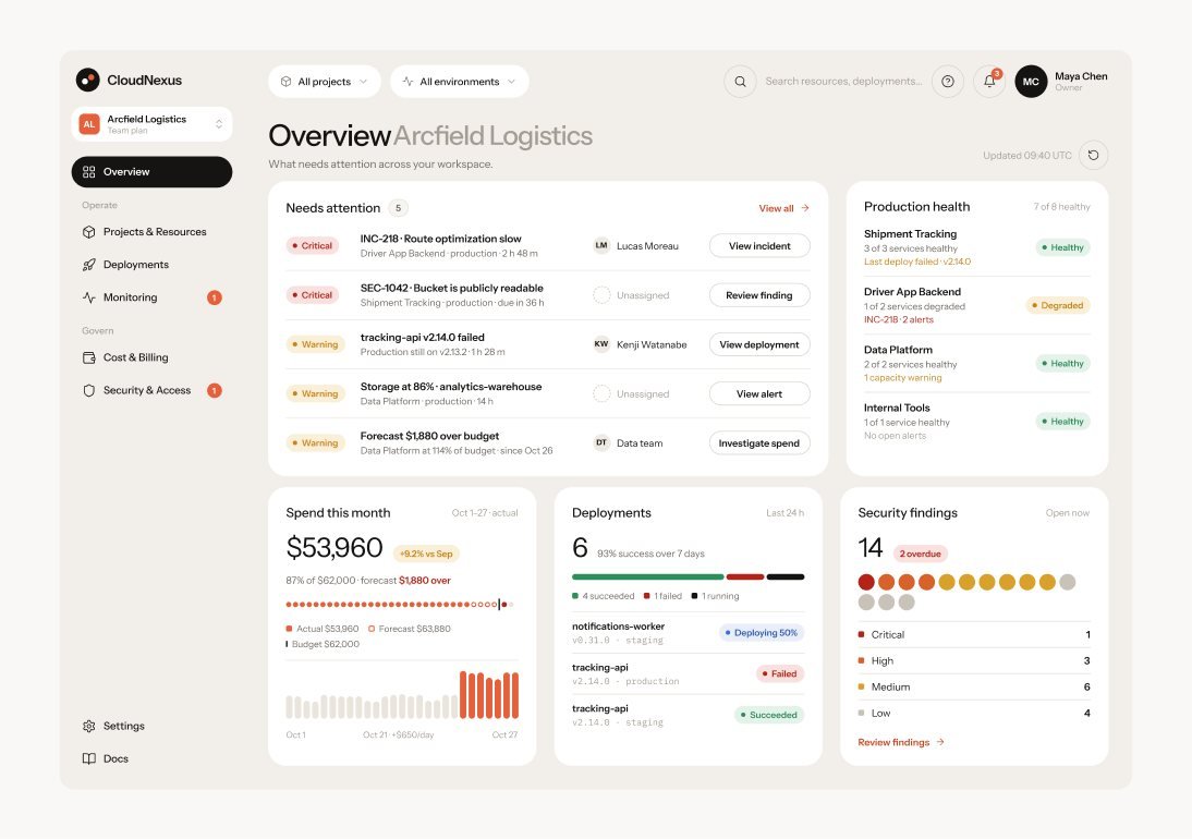
Editorial
Warm paper canvas, round cards, black pill actions and one coral signal.
Warm, confident, uncluttered
Luminous Chosen
Floating panels on a cool canvas, soft depth, light numerals and iridescent highlights.
Fresh, premium, expressive
Why Luminous
It felt the most like a next-generation product and made data-rich summaries shine. The trade-off was clear: gradients and texture stay in summaries and charts, while dense tables and logs fall back to plain surfaces.
Design system
Luminous: tokens first, then everything else.
Every colour, size, radius and shadow is a Figma variable or style, and every component is built on them. Screens, mockups and motion all draw from the same source.
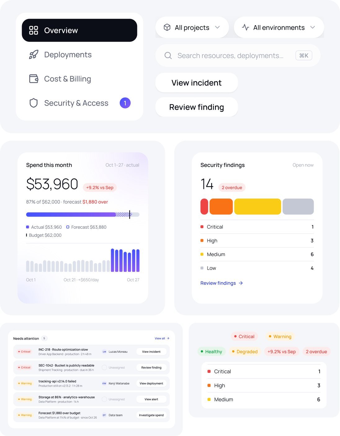
Live from the library
Every Overview card leads with the answer, then shows just enough context to act on it. Severity, health and trend chips share one shape and always pair colour with a word. One dark pill marks where you are, and scope, search and actions stay in the same place on every page.
Foundations
Built on tokens
- 153variables
- 18text styles
- 77icons
- 49components
Colour with a job, type with a voice
Semantic tokens name what a colour does, not what it looks like. Manrope carries the interface and light display numerals; DM Mono marks IDs, versions and logs.
- bg/canvas#ECEEF4
- bg/surface#FFFFFF
- bg/inverse#0B0D17
- bg/accent#4353FF
- status/success#16A34A
- status/critical#EF4444
Inside the app
The product, up close.
Device mockups and launch visuals, rendered from the real screens and the same fictional workspace. Use the arrows or pick a view to see it large.
In motion
The product, in motion.
Five short pieces show real tasks end to end, rendered from the actual screens. Each opens and closes on its launch visual, so it loops cleanly.
Overview0:00 / 0:20 · 4:3 video
UX details
The small decisions that build trust.
Confirmation matches the risk, copy says exactly what will happen, and empty, error and permission states always offer a way forward.
Confirmation matches the risk
Reversible actions, like acknowledging an alert, skip the dialog and show a toast with Undo for 10 seconds. Impactful ones, like changing a role, show before and after with a specific button label. Destructive ones, like a production rollback, ask you to type the target’s name to confirm.
Microcopy that says what happens
Buttons name the target, like “Roll back to v2.13.2”, not just “Confirm”. Permission messages explain why and who can help, such as an Admin like Daniel Okafor. Partial success never hides what didn’t work: “2 invitations sent. 1 failed.”
States are designed, not left over
Empty states say when the last check ran, and errors say what to try next. Each card loads on its own, so the page stays usable. Actions you can’t take stay visible, with the reason and who to ask.
The results
What this project delivered.
The handover covers the landing page and seven main product pages, nine key states such as drawers, dialogs and the audit log, and a library of 49 components built on 153 variables. Everything is delivered in one organised Figma file, with pages in product order, named layers, and documentation for every component, state and token, so a team can start building without guesswork.

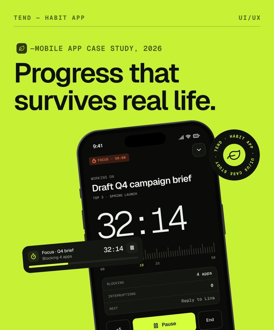
Case study: How Tend plans habits, tasks and focus around the day you actually have
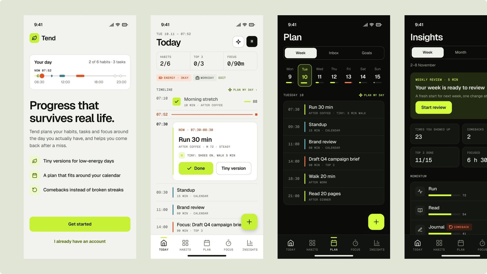
Mobile app screens in light and dark and the Instrument design system for Tend, a concept habit and productivity app that helps people plan around real days and come back after a miss.
- Role
- Product design, UX, UI
- Scope
- 35 screens in dark and light, plus a design system
- Tools
- Figma
- Type
- Concept project, 2026
Overview
Habits, tasks and focus around the day you actually have.
Tend is a fictional habit and productivity app for the phone. It joins habits, a daily Top 3 and focus sessions in one loop, and gives every habit a smaller version for hard days.
One day, one loop
- Check in
- Plan my day
- Today
- Focus
- Shut down
The problem
Most habit and planning apps assume a perfect day. One miss resets a streak, plans ignore the calendar, and a low-energy day counts as failure.
The goal
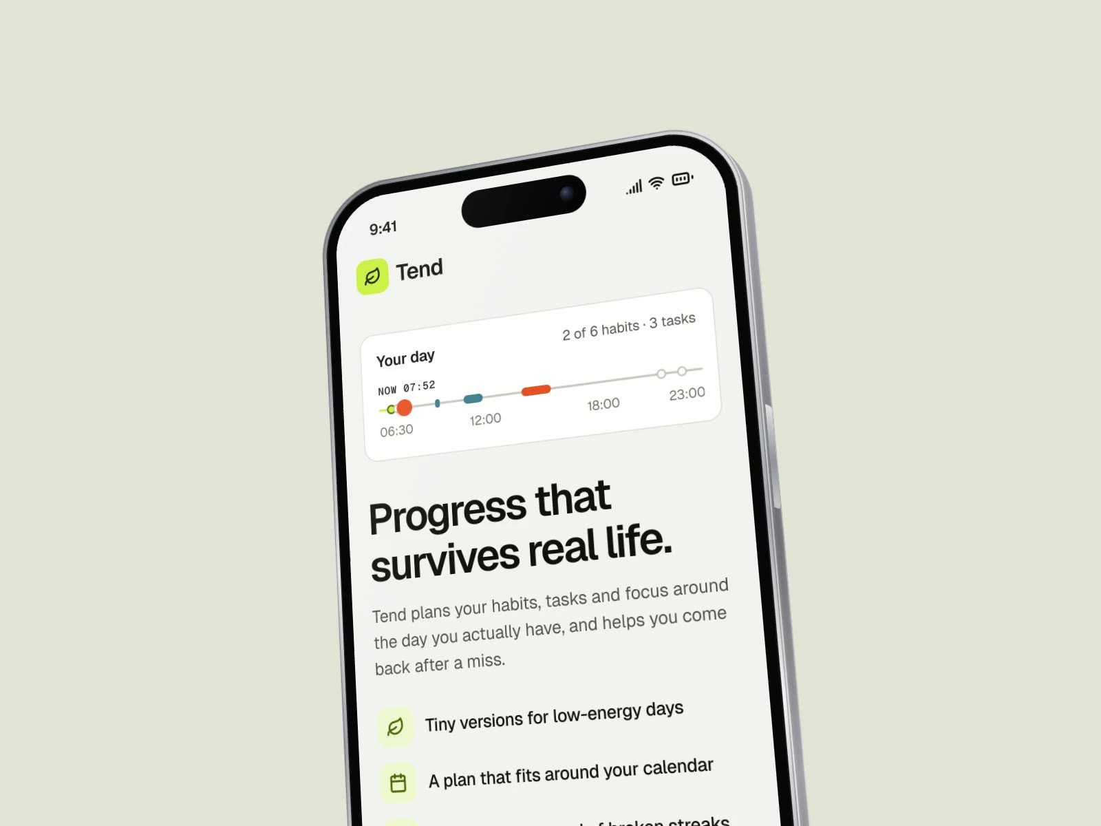
Make progress survive real life: plan around the day you have, keep a smaller version for hard days, and make coming back after a miss feel normal.
My role
End-to-end product design: three visual directions, foundations, 33 components, 69 icons, 35 screens in light and dark, and the launch visuals.
The challenge
Real days don’t fit a perfect plan.
Most habit and planning apps assume a perfect day, so one bad week is often enough to make people quit.
Everyday questions
- What should I do now?
- Do I have time for this today?
- I missed yesterday. Now what?
- What actually helps me?
Where it breaks down
- A single missed day sends a streak back to zero, so people quit after one bad week.
- Habit lists ignore the calendar, so the plan breaks the moment a meeting runs long.
- Low-energy days have no smaller option, so “not today” becomes “not at all”.
- Insights show charts without context, so it’s hard to see what actually helps.
“Momentum grows each day you show up, full or tiny. One miss never resets it.”
Research
Habit apps punish misses. Planners ignore habits.
A look at the market, habit science and 18 competitors showed where today’s apps stop, and where Tend could start.
What the numbers say
- $2.22BHabit-tracking apps, 2026Growing about 14% a year
- 66 daysTo build a habitMedian time for a habit to become automatic; one miss barely matters
- 1–4Free habitsIn most trackers, before the paywall
- 37.7%Trial to paidMedian in Health & Fitness, so the first session decides
Where the competition stops
Streaks auto-completes from Health data, but it’s iOS only and built on day-by-day chains. Finch is a warm self-care pet with the basics behind a paywall. Structured has a visual day timeline, but habits come second. Tiimo is an AI planner built for ADHD, planning first and habits second. Opal blocks apps well, but strict mode is paywalled.
The gap
No app joins habit-first design, calendar-aware planning and kind recovery on the phone. Tend is built for that gap: unlimited free habits, a plan that bends to the day, and progress that survives a miss.
Goals and principles
Success means a kept week, not a perfect streak.
Every goal is tied to something people actually do, with a signal to measure it, and every principle keeps a bad day from becoming a lost week.
Product goals
Five goals, each with a signal: a first habit logged in onboarding (70% in the first session), a Comeback after two missed days (50% back within a week), a planned day with the Top 3 done (day 7 retention of 22%), reminders that don’t nag (opt-out under 10% a month) and a closed weekly review (35% of weekly users). All are targets to test, not results.
Design principles
Four principles shaped every screen. Momentum, not streaks: a miss slows progress but never resets it. Always a tiny version: every habit has a smaller version and a cue. One timeline: habits, Top 3 and meetings share the real calendar. Suggest, never surprise: nothing changes until you accept it.
Persona
Four people, one calm app, different days.
Maya restarts, Arjun juggles, Sofia needs a first step and Kenji wants evidence. Each one stress-tested a different part of the daily loop.

Maya, 29
The Restarter · marketing manager
“I don’t need another streak to lose.”
Maya wants to exercise three times a week, read before bed and sleep by 23:30. Today one miss breaks a 20-day streak, reminders turn into noise, and a paywall blocks her fourth habit. She mostly uses Today, Habit detail and Comebacks.

Arjun, 37
The Juggler · engineering manager, two kids
“My day is decided by my calendar. Plan around it, not on top of it.”
Arjun wants to stretch daily, read to the kids and ship the one thing that matters. Today trackers ignore his calendar, plans are dead by 10:00, and there are too many apps to open. He mostly uses Plan my day, widgets and the evening shutdown.

Sofia, 23
The Focus-seeker · master’s student with ADHD
“If I can see the next small step, I can start.”
Sofia wants to start assignments without avoidance, keep a morning routine and know how long things take. Today long lists freeze her, time disappears, and red badges and guilt copy make it worse. She mostly uses Focus, the routine player and Calm mode.

Kenji, 44
The Optimiser · product director, pays for Plus
“Show me what actually moves the needle, and show me why.”
Kenji wants to see which habits move his sleep, join health data with his habits and run a serious weekly review. Today his data sits in five apps with no answers, and insights are generic, with no evidence. He mostly uses Insights, Patterns and the weekly review.
The approach
From research to a system, then every screen.
Research and strategy first, then structure and three directions, then a system and every screen in light and dark.
Process
The work moved through six stages. Research covered the market, 18 competitors, habit science and nine recurring problems. Strategy set the positioning, principles, daily loop and metrics. Structure defined a five-tab IA, three journeys and eight core flows. Explore tested Field Notes, Bloom and Instrument on five key screens. System built the tokens, 33 components and 69 icons, and Design produced 35 screens for handover.
Information architecture
Five tabs, with sheets for quick actions.
Quick actions like logging a habit or adding a task open as sheets, so people never leave the tab they are on.
Today
- Daily check-in
- Plan my day
- Log sheet
- Evening shutdown
Habits
- Habit detail
- Habit builder
- Routines
- Templates
Plan
- Week
- Task detail
- Goal detail
- Quick add
Focus
- Focus setup
- Active session
- Session summary
Insights
- Weekly review
- Patterns
- Coach
Outside the tabs: onboarding, settings, Tend Plus, the lock screen with its Live Activity, and home-screen widgets.
Core flows
Maya recovers from a miss
It starts after two missed days. Maya opens Today, her run offers a Comeback, and Momentum shows a dip, not a reset. She picks the tiny version for three days and logs “shoes on, walk 5 min” in one tap. Momentum climbs again, and the weekly review counts the Comeback.
Arjun plans his Tuesday
It starts with his first open after 07:00. After a ten-second check-in, Arjun taps Plan my day, and habits and his Top 3 land in free gaps, each with a reason. He moves the run and accepts the rest, reminders and calendar blocks are set, and the evening shutdown moves what’s left.
Sofia starts deep work
It starts from her Top 3 task. Sofia taps Start focus and picks 50 minutes with blocking on, so four distracting apps are blocked. She notes a distraction without leaving, the timer stays on the lock screen, and the summary shows 50 minutes focused with two notes kept.
Visual direction
Three directions. Instrument won.
Each direction redrew the same five key screens in light and dark, so the choice came down to how each one handled a real day.
Three directions
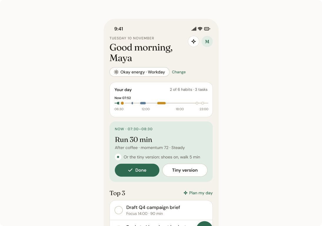
Field Notes
The whole day is drawn as one arc from wake to sleep, like a well-kept notebook.
Calm and editorial
Bloom
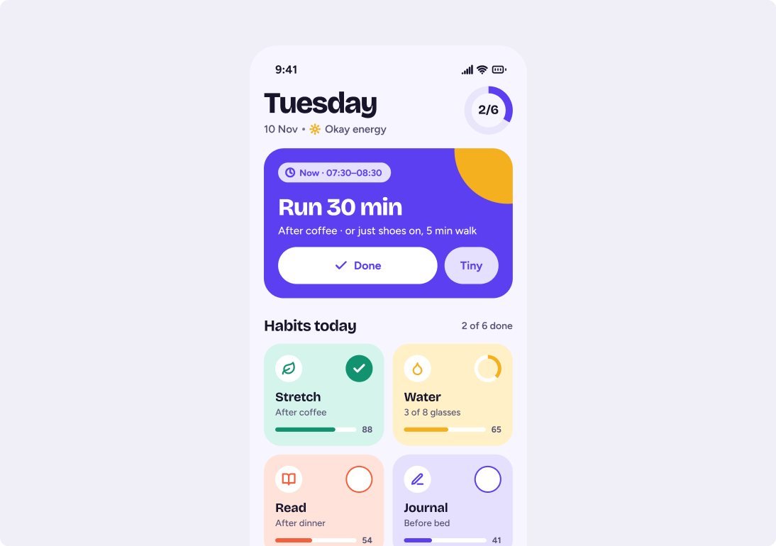
Big tinted habit tiles with giant checks, and wins celebrated with colour.
Expressive and playful
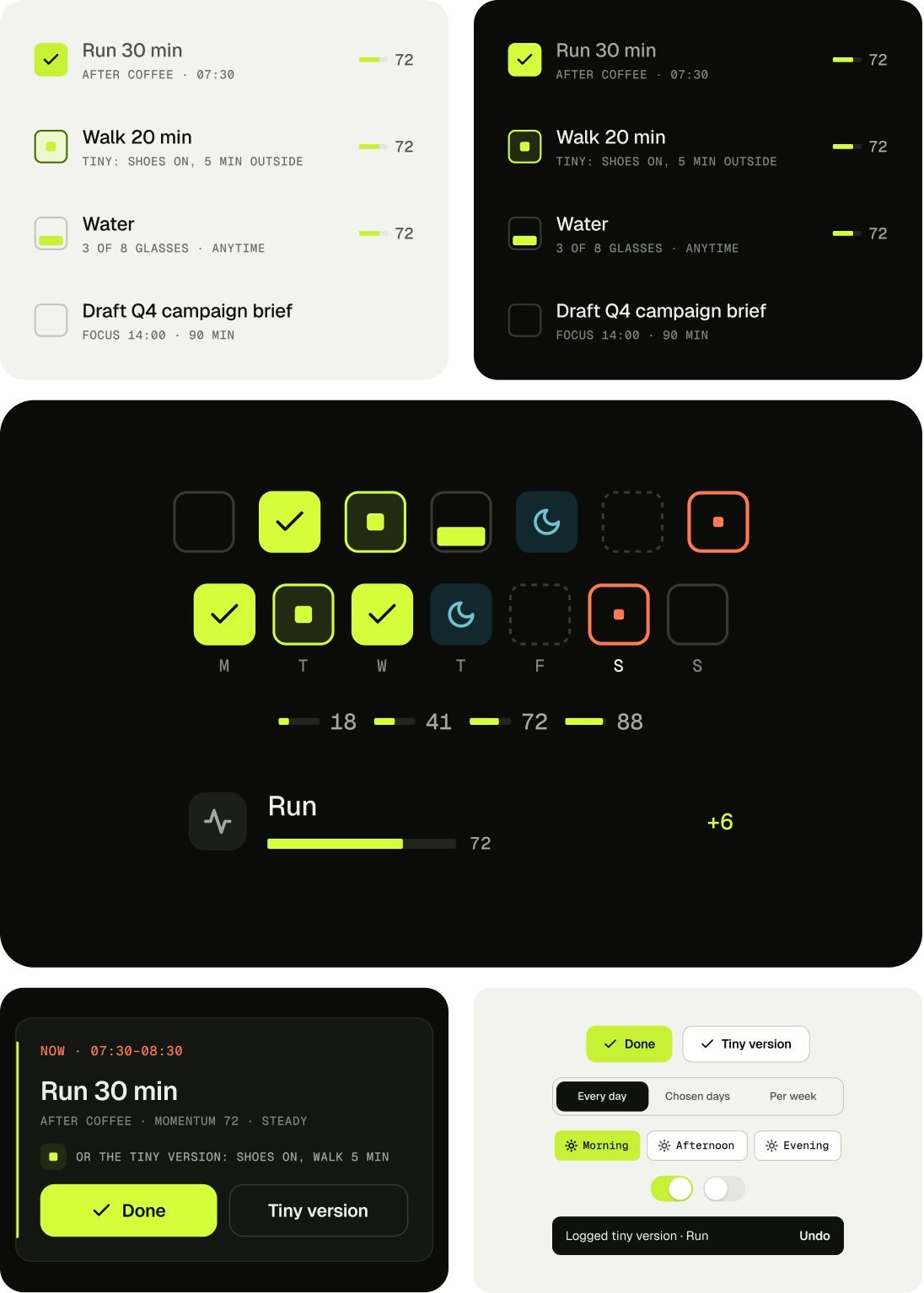
Instrument Chosen
A time gutter runs down Today, and every habit shows its recent days.
Precise, data-dense, dark-first

Why Instrument
It suits people who like to see their numbers, and it never relies on colour alone: every state also has a shape, and a missed habit is a dashed square, never red.
Design system
One system, light and dark.
Geist for the interface, Geist Mono for every number, time and label. Square geometry, 1 pt rules and no soft blobs.
Live from the library
Five habit states share one row, so due, done, tiny, partial and rest read at a glance, and the Now card keeps the tiny version one tap away. Checks, week days and Momentum never rely on colour alone, so they hold up for colour-blind users and in Calm mode. Each screen has one lime action, with quiet secondary actions and controls sized for thumbs at the largest text sizes.
Foundations
Built from components
- 33components
- 22with variants
- 69icons
- 35screens
Colour with a job
Each colour means one thing, and every state has a shape too, so nothing depends on colour alone.
- LimeDone
- OrangeNow
- TealRest
- InkBackground
- PaperText
- MissedNever red
Inside the app
Five moments, one calm app.
Mockups for five moments of the day: getting started, running the day, building a habit, deep work and reflecting on the week.
In motion
The product, in motion.
Six short videos, from the whole app in 28 seconds to getting started, running the day, building a habit, deep work and the weekly reflection.
Overview0:00 / 0:28 · 4:3 video
The results
What this project delivered.
The handover covers 35 screens in light and dark, a library of 33 components (22 with variants), 69 icons on a 24 px grid with a 1.8 stroke, and 12 launch visuals. Everything is delivered in one organised Figma file, with screens grouped by flow, named layers, and documentation for every component, token and screen, ready for development.

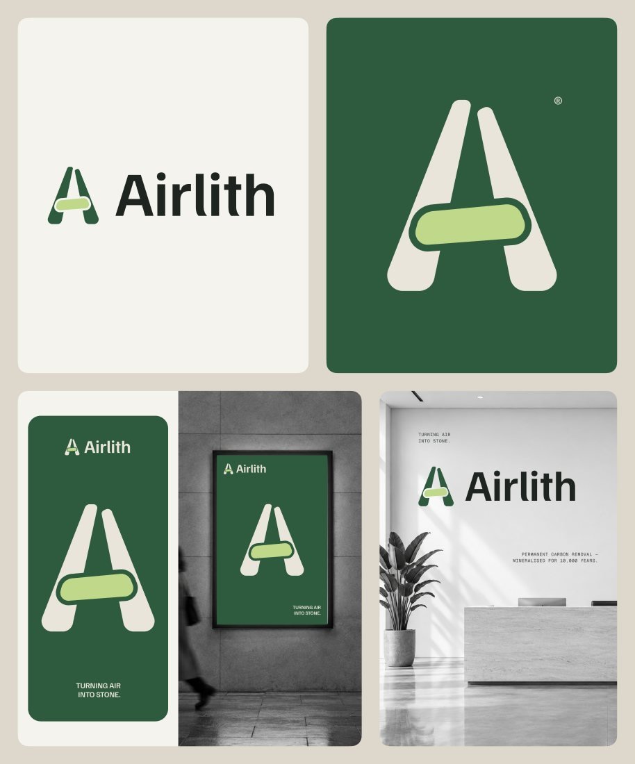
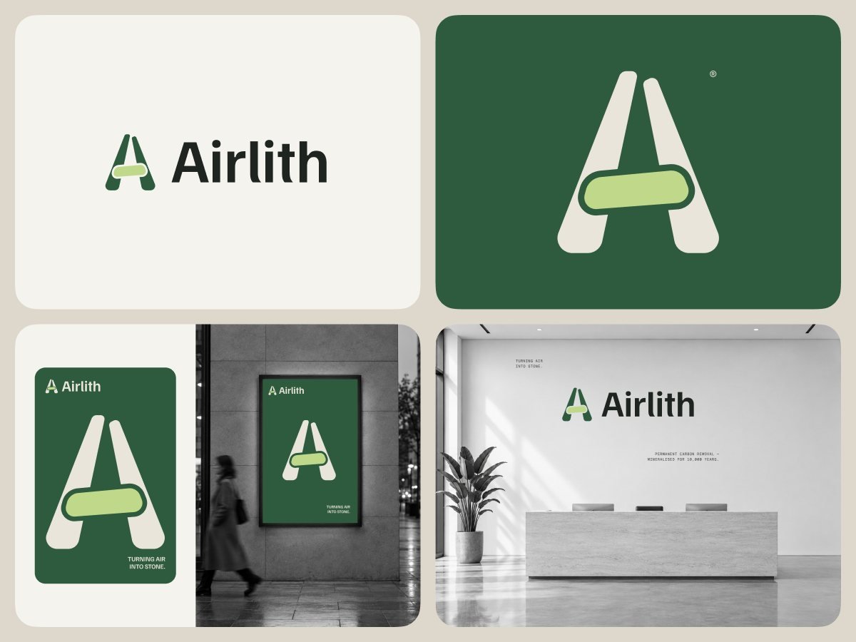
Case study: How Airlith makes carbon removal feel as solid as stone
Brand strategy, name and identity for Airlith, a concept carbon removal company that pulls CO₂ out of the air and turns it into rock underground.
- Role
- Brand strategy, identity design
- Scope
- Name, identity and eight applications
- Tools
- Figma
- Type
- Concept project, 2026

Overview
A brand for CO₂ that ends up as stone.
Airlith is a fictional carbon removal company. It captures CO₂ from the air and stores it in basalt underground, where it turns to stone for good.
How Airlith works
- Capture CO₂
- Add water
- Pump into basalt
- Turns to stone
The brief
Airlith takes CO₂ from the air and stores it in basalt, where it turns to stone. It needed a name and a brand before its first sale.
The goal
Make an invisible product feel real and permanent: one simple idea, a calm mineral palette, and a system that works from a site sign to a removal certificate.
My role
Brand strategy and identity: research, positioning, the name, three logo directions, the final mark, colour, type and eight applications.
The challenge
Carbon removal has a trust problem.
Buyers, investors and the town next to the site all need a reason to believe in something they will never see.
Buyer questions
- Is it permanent?
- Can I check it?
- Is this just another offset?
- Will the tonnes actually arrive?
Where it breaks down
- Years of weak offsets taught buyers to doubt every climate claim.
- The product is invisible: a tonne of removed CO₂ looks like nothing at all.
- Most brands show machines, skies or leaves, not the result people pay for.
- A CFO, an investor and the town next to the site each need their own reason to trust it.
“Air goes in. Stone comes out. The brand has to say that in one look.”
Research
Demand is growing fast. Trust isn’t.
Removal demand is climbing, but very little has been delivered, and the category still leans on images buyers distrust.
What the numbers say
- 7–9 GtNeeded every yearCO₂ removal by 2050 to meet the Paris goals
- 29 MtContracted in 2025Durable removal, up from 8 Mt in 2024
- 0.05%DeliveredOf direct air capture tonnes sold, by mid-2025
- 90%Turned to stoneOf CO₂ pumped into basalt in Iceland, within two years
- <0.1%From new methodsOf today’s removal; the rest is mostly forests
- ~90%One buyerOf 2025 removal purchases came from Microsoft
How the category shows up
Climeworks is the trusted pioneer, but it leads with machines. Heirloom tells a warm limestone story, but soft words hide the how. Carbfix says CO₂ to stone clearly, but reads as science, not brand. 44.01 has a bold, simple promise in a generic climate-tech look, and offsets feel familiar but their skies and leaves are distrusted.
Brand strategy
One idea: make removal feel solid.
A short brand platform and four principles kept every decision, from the name to the certificate, pointing the same way.
Brand platform
Purpose: put carbon back where it came from, the ground. Positioning: removal you can stand on, permanent, measured, in stone. Promise: turning air into stone, the tagline on every first touch. Personality: grounded, precise, patient and open. Name: air + lithos, Greek for stone, the process in one word.
Design principles
Four principles to design by. Show the result: lead with stone, not machines or skies. Weight over shine: heavy shapes and matte colours, because solid things feel trustworthy. Every claim has a number: tonnes, dates and sites sit beside every promise, set in mono. Plain words: a CFO and a café owner should both get the same sentence.
Process
From research to a mark, then every touchpoint.
Discovery and a clear platform first, then the name and three logo directions, then a system and eight applications.
Six stages
Discover covered the market, competitors, buyer insights and the science of storing carbon in rock. Define set four audiences, the brand platform and four principles. Name tested options for meaning, sound and spelling until one word told the story. Explore tried three logo directions, each at 16 px and on a six-metre wall. System set logo rules, five colours, two typefaces and a photo style, and Deliver produced eight applications.
Category codes
Codes we left behind, and codes we took.
The category leans on images buyers already distrust, so Airlith is built from the ground instead.
The category
- Blue skies
- Green leaves
- Globes
- Glowing gradients
- Fans and machines
Airlith
- Stone
- Strata
- Weight
- Mineral colours
- Real numbers
Logo directions
Three directions. Monolith won.
Each direction was tested at 16 px and on a six-metre wall, so the mark had to work as a favicon and as a building sign.
Three directions
Strata
Layers of rock building up over time. Clear, but it read as a mountain, and the thin bands vanished at small sizes.
Direction 01

Captured air
A stone with bubbles of air locked inside. Friendly and literal, but too playful for a company that sells to boards.
Direction 02

Monolith Chosen
Two leaning slabs form an A and hold a pebble of stored carbon. One shape tells the whole story.
Direction 03

Why Monolith
It carries the whole process: the slabs are the rock, the pebble is the stored CO₂, and the thin gap around it is the air that has been taken out. It holds up at 16 px and on a six-metre wall.
Logo
One A, built from stone and air.
The mark is the whole process in one shape, with rules that keep it clear from 16 px to a full wall.
How the mark is built
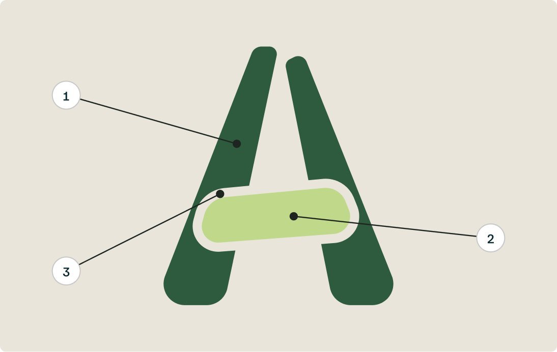
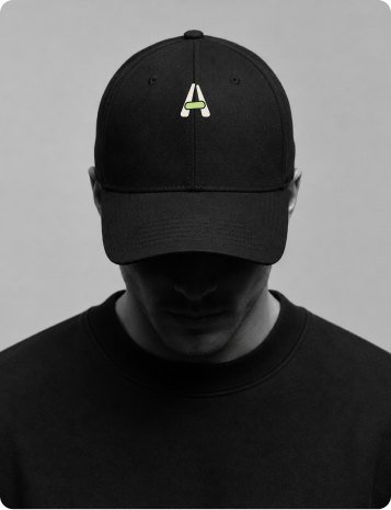
Two slabs of basalt lean together (1): they are the rock. Between them sits a pebble of mineralised carbon (2), with a thin gap of air around it (3): the air that was taken out.
Lockup and clear space
The pebble’s height sets the clear space on every side. The mark never goes below 16 px, and the lockup never below 96 px wide.

 48 px
- 32 px
- 16 px min
Colour versions
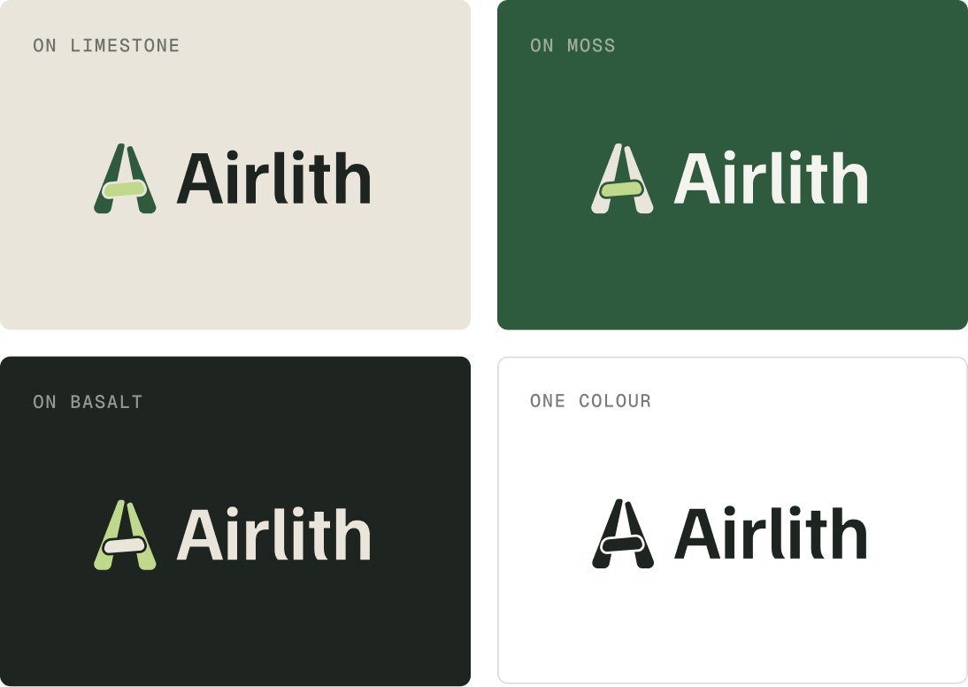
The lockup works on limestone, moss and basalt, and in one colour, so it holds on any surface the brand meets.
Colour and type
A palette dug from the ground.
Every colour comes from rock and lichen, and each one has a single job. Two typefaces split the work between words and numbers.
Foundations
Colour with a job
Moss is the brand, lichen marks stored carbon, limestone is the background, basalt carries text and chalk is the surface.
- Moss#2E5B3E
- Lichen#BFD88A
- Limestone#E9E5DA
- Basalt#1E2420
- Chalk#F5F3EE
Type with weight
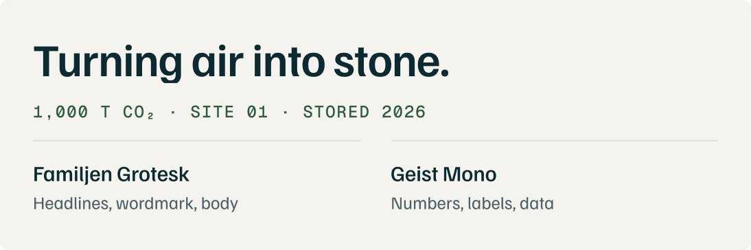
Familjen Grotesk is sturdy and a little irregular, like cut stone, and sets headlines, the wordmark and body. Geist Mono carries every tonne, date and site.
Applications
The brand in the world.
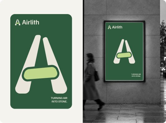
Eight applications were designed, from a street poster to a removal certificate. Six of them are shown here.


The results
What this project delivered.
The handover is a complete identity for launch: three explored logo directions with Monolith as the final mark, five colours from rock and lichen, two typefaces for words and numbers, and eight applications from a street poster to a removal certificate. Everything is delivered in one organised Figma file with logo exports and colour and type styles, plus brand guidelines that document clear space, minimum sizes and how each colour is used.



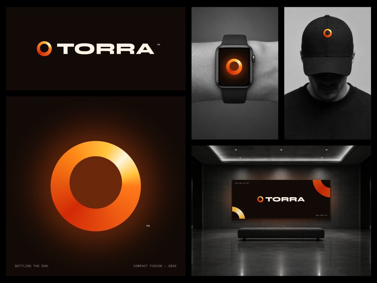
Case study: How Torra makes compact fusion feel close enough to hold
Name, mark and identity for Torra, a concept compact fusion company, created for Octave’s Logo Lab: ten invented brands for the industries defining 2026.
- Role
- Brand identity, logo design
- Scope
- Name, mark, wordmark and five mockups
- Tools
- Figma
- Type
- Concept project, 2026
Overview
A brand for the power that lights the sun.
Torra is a fictional compact fusion energy company, one of ten invented brands in Octave’s Logo Lab for 2026. Its line is three words: Bottling the sun.
How fusion works
- Heat the fuel
- Hold the plasma
- Fuse atoms
- Make power
The brief
Torra needed a name, a mark and a first set of applications that make compact fusion feel close, safe and real.
The goal
Turn the hardest idea in energy into one simple shape: a ring of contained light that reads as the sun and as the reactor at once.
My role
Brand identity: the name, the mark, the wordmark, colour and type, and five mockups, from a watch face to a gallery wall.
The challenge
Fusion has always been thirty years away.
Fusion is moving from labs toward power plants, but the category still looks like research, and people have heard the promise before.
What people ask
- Is it safe?
- When will it be real?
- Is it just a science project?
- Who will buy the power?
Where it breaks down
- Working fusion has been promised as decades away for decades, so every new claim meets doubt.
- Most fusion brands lead with lab hardware and plasma photos, which reads as research, not as a power company.
- The word nuclear brings fear, even though fusion works differently from fission.
- Investors, utilities and the public each need a different reason to believe.
“The sun runs on fusion. Torra puts it in a bottle.”
Research
Money is pouring in. Belief has to follow.
Investment and timelines have moved fast and the physics promise is huge, but the category still has to earn trust.
What the numbers say
- $9.8BInvested in fusionAcross 53 companies, up to July 2025
- $2.64BRaised in one yearUp 178% in the 12 months to July 2025
- 84%Expect grid powerOf surveyed companies, before the end of the 2030s
- ~4M×Energy per kilogramFusion against burning oil or coal
- 100M °C+To fuse on EarthAbout ten times hotter than fusion in the sun
- 200 MWFirst big offtakeGoogle, from a planned fusion plant, early 2030s
How the category shows up
Most fusion companies lead with lab hardware, plasma photos and cool sci-fi blues. It signals serious science, but it reads as research rather than as a power company people can rely on.
Brand strategy
One idea: a sun you can hold.
A short platform and three principles kept the name, the mark and every mockup pointing the same way.
Brand platform
Purpose: make clean, always-on power from the reaction that lights the sun. Promise: bottling the sun. Personality: warm, exact, confident and calm. Name: Torra, from torus, the ring-shaped chamber that holds the plasma.
Design principles
Three principles shaped the identity. Light, not lab: lead with warmth and glow instead of hardware and sci-fi blue. One shape: the ring works as the sun, the reactor and the brand, from a watch face to a gallery wall. Heavy type, quiet words: a wide, bold wordmark carries the confidence, and a small mono line carries the facts.
Logo directions
Three directions. The ring won.
Each direction tried a different way to show fusion in one shape, from the sun itself to the machine that holds it.
Three directions
Sunburst
A sun with twelve short rays. Warm and instant, but it read as solar power, not fusion, and the thin rays vanished at small sizes.
Direction 01

Orbit
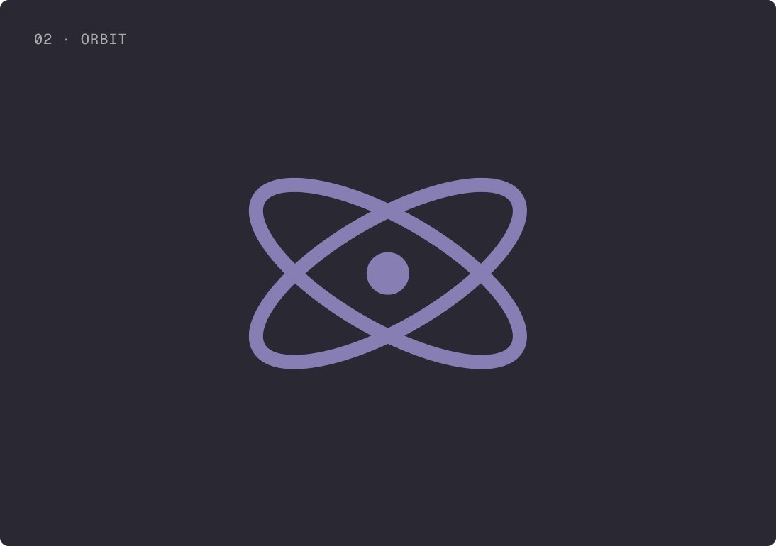
Two crossing orbits around a core, like an atom. Familiar, but it said nuclear in the way people fear, and looked like every science logo.
Direction 02
Ring Chosen
A single ring of contained light: the sun and the torus that holds the plasma, in one shape.
Direction 03

Why the ring
It carries the whole idea: the ring is the disc of the sun and the doughnut-shaped chamber where fusion happens, and the glow is the energy held inside. It works on a watch face and on a gallery wall.
Logo
One ring, built from light.
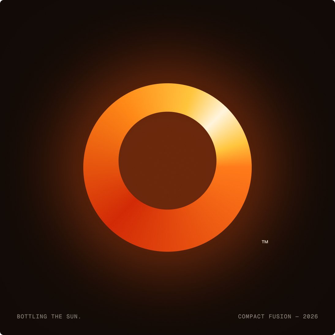
The mark is a single ring of light: the disc of the sun and the doughnut-shaped chamber of a fusion machine in one shape.
How the mark is built
An angular gradient runs from deep ember red through orange to a white-hot highlight, so the ring looks lit from inside, like plasma held in place.
Lockup and wordmark
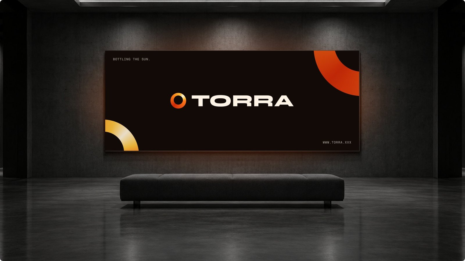
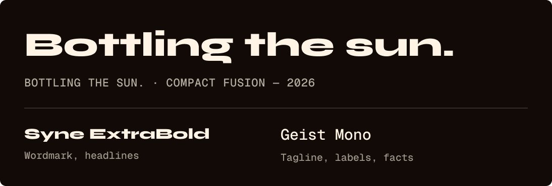
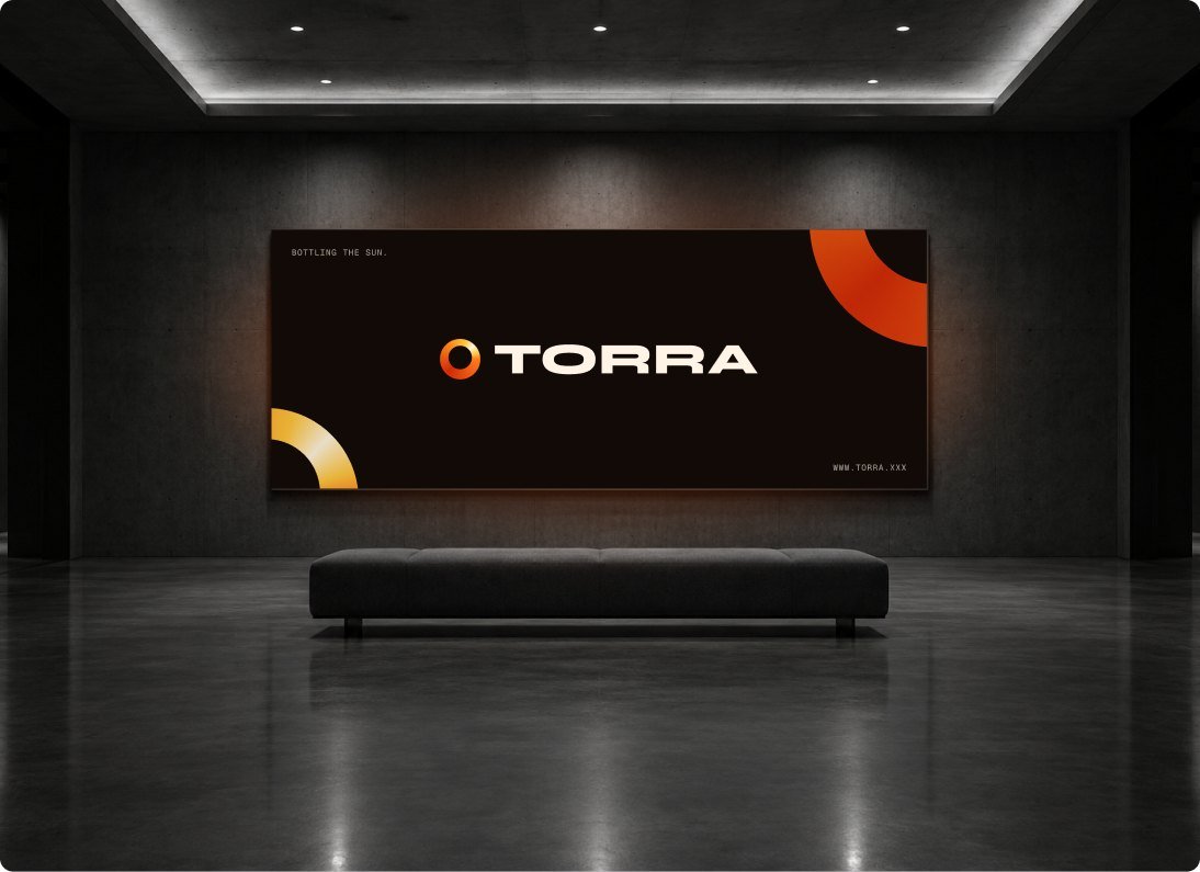
The ring sits before a wide, heavy TORRA set in Syne ExtraBold. On the poster, the small print sits in Geist Mono at the corners.

Colour and type
A palette taken from a star.
Every colour comes from the ring’s gradient and the dark it glows in. Two typefaces split the work between the name and the facts.
Foundations
Colour with a job
Flare is the brand, ember gives the ring its depth, gold and corona make the highlight, and night is the dark every piece glows in.
- Flare#FF7A1A
- Ember#D22A06
- Gold#FFC53D
- Corona#FFF4DC
- Night#120A06
Type with weight
Syne ExtraBold gives the wordmark a wide, heavy stance. Geist Mono carries the small print, like the tagline and the year.
Applications
The ring in the world.
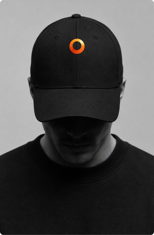
Five mockups show the identity at work. The lockup and the mark poster sit in the Logo section above, and the rest are here.

The results
What this project delivered.
Torra is the second of ten identities in Octave’s 2026 Logo Lab. The handover is the ring mark and the TORRA wordmark, two typefaces, Syne and Geist Mono, and five mockups from a watch face to a gallery wall. Everything is delivered in one organised Figma file with logo exports and colour and type styles, plus short brand guidelines on using the ring at every size.


Case study: How Octave shows leaders what changed, why, and who should act
Eleven dashboard pages in light and dark, mobile views, a landing page and the design system for Octave, a concept business intelligence product for SaaS and cloud companies.
- Role
- Product design, UX, UI, data visualisation
- Scope
- 11 dashboard pages, mobile, landing page and a design system
- Tools
- Figma
- Type
- Concept project, 2026

Overview
Know what changed, why, and who should act.
Octave is a fictional business intelligence product built on Microsoft Power BI. It connects revenue, customers, cloud cost and operations in one governed model, so every number traces back to its records.
From number to action
- KPI
- What changed
- Driver
- Record
- Owner
The problem
Leaders get numbers from reports that define the same metric in different ways. A KPI shows a value, but not whether it is on plan, what moved it, or which accounts sit behind it.
The goal
Turn dashboards into decisions: one definition of every metric, a variance on every number, and a path from any KPI to the records behind it.
My role
End-to-end product design: information architecture, 11 dashboard pages in light and dark, mobile views, the landing page and demo flow, and a design system with 29 components and 78 icons.
The challenge
Dashboards show numbers. Leaders need decisions.
Every team asks a different question of the same data, and most reports leave the answer to whoever reads the chart.
Everyday questions
- Are we on track?
- What moved ARR?
- Will we close the quarter?
- Which accounts need action?
Where it breaks down
- The same metric is defined differently from one report to the next.
- Numbers appear without a plan, prior period or prior year to compare against.
- Charts show that something changed, but not what moved it.
- There is no path from a KPI to the accounts, deals or cost lines behind it.
“Every number traces back to its records.”
Principles
Six capabilities turn dashboards into decisions.
Every page shares the same definitions, filters and drill paths, so a number means the same thing wherever it appears.
Six capabilities
One metric model: ARR, NRR and margin are defined once and used everywhere. Variance everywhere: every KPI sits against plan, prior period or prior year. Explain the change: bridges and driver trees show what moved a number. Drill to the record: any KPI opens the accounts, deals, tickets or cost lines behind it. Alerts reach the owner, and anyone can ask in plain language over certified data.
One question per page
Every page opens with the question it answers. Executive Overview asks whether FY2026 is on track and where the risk is, Customer Health asks which accounts need action now, and Cloud Infrastructure & Cost asks what drives spend and where to save.
The approach
One model, eleven pages, two themes.
Foundations first, then components, then every page in light and dark, and finally mobile, the landing page and launch mockups.
Process
The work moved from foundations to pages. Semantic colour tokens with light and dark values and type and spacing scales came first, then 29 components and 78 icons. Those built eleven dashboard pages in both themes, four mobile pages, a landing page with a two-step demo request, and launch mockups.
Information architecture
Four groups, ten dashboards, one drill-down.
Every dashboard sits in one of four groups, and Account Detail opens from any account without losing your filters.
Overview
- Executive Overview
Revenue
- Revenue & ARR
- Pipeline & Bookings
- Marketing
Customers
- Retention & Churn
- Customer Health
- Product Usage
Finance
- Financials
- Cloud Cost
- Support & Service
Around the pages: saved views, alerts, a metric library and settings, plus Account Detail for any single account.
Core flows
Daniel checks whether FY2026 is on track
It starts on Executive Overview. Daniel, the CEO, sees ARR at $184.2M, 98% of plan, and net new ARR marked Off track. What changed ranks three insights by dollar impact, led by APAC sitting $3.8M behind plan, and each insight links to the page that explains it.
From an at-risk account to its record
It starts on Customer Health, where the account work queue is sorted by priority. Opening Brightwell Logistics, marked At risk, shows Account Detail with ARR, renewal date, health score and revenue history, and drill-through keeps the period, region and segment filters.
A visitor requests a demo
It starts on the landing page. A visitor enters a work email, company size, role and the teams that should see the demo, then picks a 30-minute slot with a solutions engineer and confirms it in step two.
Visual direction
Three directions on one screen. Ledger won.
Each direction redrew the same Executive Overview with its own colour, type and density, using the same data.
Three directions
Command
Light and mono, like an engineering console, with a cyan accent. Precise for analysts, but cold and dense in a leadership meeting, and mono numbers were slower to compare.
Fast, dense, technical
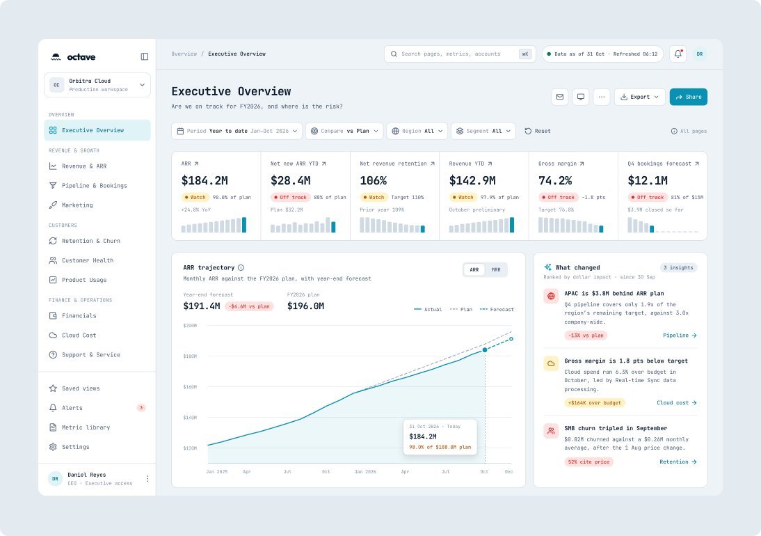
Editorial
Warm paper, serif numbers and generous space, like an annual report. Lovely to read, but too slow to scan when every number needs a variance.
Warm, considered, slow

Ledger Chosen
Quiet neutrals, one purple accent and Inter throughout. Every status pairs colour with a word, and dark mode comes from the same tokens.
Calm, precise, accountable

Why Ledger
It keeps the data in front. Neutral surfaces let variances and status chips do the talking, purple marks only actuals and actions, and every colour token has a dark value, so one file serves both themes.
Design system
Semantic tokens, light and dark from one file.
Inter for the interface and Geist Mono for overlines and keyboard hints, on an 8-point rhythm with 12 px card corners and 36 px controls.
Live from the library
Every KPI card pairs the value with a status chip and a delta against plan, so Watch and Off track read the same on every page. Insight items rank what changed by dollar impact, and the global filter bar, sidebar and page header keep every dashboard in the same frame.
Foundations
Built on tokens
- 67variables
- 18text styles
- 78icons
- 29components
Colour with a job
Semantic tokens name what a colour does. Status always pairs colour with a word, and charts use purple for actuals and grey for plan.
- bg/accent#5F4BA6
- text/primary#101114
- bg/app#F9FAFB
- status/positive#2A714B
- status/warning#8C5D1A
- status/negative#BD4033

Inside the app
Eleven pages, light and dark.
Launch mockups for the main dashboards, from Executive Overview to Customer Health and its account drill-down.
In motion
The product, in motion.
Seven short pieces walk through real tasks, from the Executive Overview and Customer Health to usage and cloud cost, financials and support, and end on the phone.

Executive Overview0:00 / 0:25 · 4:3 video
UX details
The small decisions that build trust in a number.
Freshness, definitions and honest charts sit next to the data, so nobody has to ask whether a number is right.
Numbers you can trust
Every page shows when data was refreshed, like “Data as of 31 Oct · Refreshed 06:12”, and definitions sit beside the chart, such as how Q4 coverage is calculated.
Charts that don’t mislead
When an axis doesn’t start at zero, the subtitle says so, and status always pairs colour with a word, Watch or Off track, so it never relies on colour alone.
Context that travels
Drill-through keeps your filters, so moving from Customer Health to an account never resets the period, region or segment.
The results
What this project delivered.
The handover covers 11 dashboard pages in light and dark, a library of 29 components with 38 variants, and 78 icons on a 20 px grid. Everything is delivered in one organised Figma file, with light and dark tokens, named layers, and documentation for every page, component and metric definition, ready for a Power BI team to build from.

What does yourbusiness need?
Pick everything that applies. It goes straight into the project form, so we start from the same page.
Or email heyoctave.inquiry@gmail.com